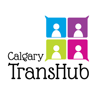
Another logo from concept to finished product! This is part of a bigger project I'm working on with the client. In this case the logo is just the beginning (a logo is a great place to start) on what will be a brand look and feel for a resource website.
The brief? Create a logo that encompasses a sense of community and belonging.
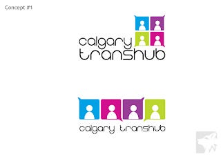
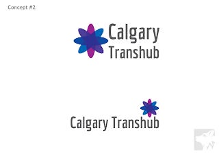
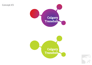
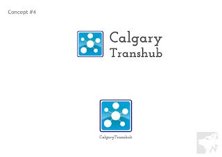
The initial concepts shown with slight variations.
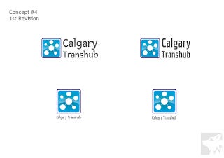
I am always eager to give the client a few different options to work with so when they came back and wanted to play with Concepts #1 and #4 I was happy to accommodate.
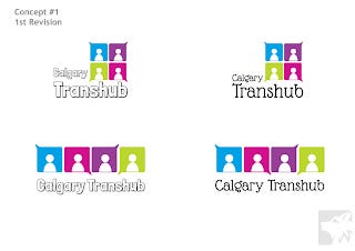
In both cases it was the fonts they wanted to play with. I gave them a few different options based on the feedback provided. This clinched it - Concept #1 was the way to go. They requested one minor change: to see it with the 'H' capitalised and with a space.
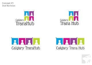
And voila! The final logo: